Choice color range- one of the most important stages in creating an interior. Color will affect your perception of the room and your attitude towards it, and your mood while you are in it. Color can also help adjust the shape of a space, expand or narrow it, raise ceilings, or make large furniture “invisible.” Let's talk about what colors can be combined with each other in the interior.
What colors go together in the interior?
I talked about the basic rules for using color when creating an interior: I recommend starting with it in order to at least understand the terms. Now let's talk about the types of color harmonies - useful diagrams choosing colors that complement each other.
It is important to say here that any colors can be combined with each other in one space, but the greater the divergence from standard schemes, the more effort will have to be made to achieve harmony. The same scheme can look completely different depending on the choice of shades and amount of color, so why complicate your life?
Monochrome harmony
The simplest approach is to choose one color and use it to its fullest. Of course, in different shades (mixed with white, black or gray) and in combination with achromatic colors. Note that if you have white walls and ceiling, a light wood floor and, for example, a blue sofa, this is no longer monochrome harmony. Light wood is a bleached yellow or yellow-orange color. But if the sofa is brown, obtained by darkening yellow, the room will be monochrome.

This harmony has a high risk of being boring, so it is used mainly in hallways and corridors or small rooms such as a toilet, bathroom, laundry room. It can also be found in very minimalist interiors. However, if you use many shades, it can get quite interesting.


Caption for the picture
Polar Harmony
This harmony is made up of two colors that are opposite each other on the color wheel. These colors are also called contrasting colors. It is believed that a combination of contrasting colors is perceived by our eyes the best way, we find it very harmonious. However, it is important to apply this harmony according to certain rules. Of the two colors, one should dominate; it can be used in a wide range of shades - from the lightest to almost black, including the brightest and purest color. The second color will be complementary: take a limited spectrum (light or dark shades) and use them in doses.

There is important rule: Be sure to use shades of the mixture of colors to build a connection between them. For example, in the polar harmony of blue and orange, mix these colors in different proportions. When mixed, for example, in a 1 to 1 ratio, you will get a dark brown color that you would not achieve by simply darkening the orange.
 Mixing polar colors
In all the photos below there is a polar harmony of blue and orange.


![]()
Harmony of close colors (related)
For related harmony, select 4 colors that are next to each other on the color wheel. The only exception is the segment from yellow to red-violet; here it is permissible to take all these 5 colors. Give each of the close colors its role: one will be dominant, the other will be secondary, and the remaining two will be complementary.

Just as in polar harmony, the dominant color can be used in the full spectrum from light to dark, the secondary color can be used excluding bright and pure shades and is noticeably less in quantity, and additional ones are very limited. For example, in the harmony indicated below, for example, yellow may dominate, while green may be secondary. Then, for example, we will see yellow-green as a very light light green, and yellow-orange as dark brown.


Classic triad
The triad is the most complex color scheme, but also the most frequently used: such interiors turn out to be both balanced and interesting to perceive. For a triad, three colors are taken, located equidistant from each other on the color wheel, as if at the corners of an equilateral triangle. The same approach: colors are arranged according to importance, one always dominates, the rest are used sparingly.

As for mixing colors with each other, this is important point in a triad, but there are two approaches:
Option 1. Use shades of a mixture of dominant and secondary and shades of a mixture of dominant and tertiary, but do not mix the additional colors themselves.
Option 2. Mix additional colors into one color and then mix it with the dominant one. This mixed color can be lightened and darkened, diluted with gray, like the main and secondary colors.


You can choose color harmony without fussing with paints using this program.
Below we have collected examples of how you can combine colors with each other. It doesn’t matter what shade is your favorite in the interior - yellow, green, orange, purple - you can choose a successful combination for any room.
Red and purple shades


Blue and cyan color


Green in combination with other colors


We renovate to last for decades and choose colors carefully. Therefore, more often you will find light, neutral interiors, where brown or gray is added to beige. But don’t immediately say that this is a boring trio. They are universal. And by pairing them with one spectacular color, you will get bright interior and you won’t be moping when there are nine months of bad weather outside.
Combination of gray color in the interior
It is considered a neutral color and signifies prudence. How does it make you feel? “Gloomy and dreary,” you say. Not at all. Thundercloud, river mother-of-pearl, morning harbor or wet stone are just a few shades that come to mind. Many designers and decorators consider gray to be white's more elegant brother. It fits into any style and its undoubted advantage comes in many shades. Choosing a shade of gray is not easy, but it will suit both the living room, kitchen or bedroom, and can be combined with a large number of colors and finishing materials.
What to combine with?
Gray and yellow. At first glance, the colors are different and contradictory, but they get along well. If you make gray the main background in the room, adding yellow accents. Yellow will highlight the gray, and gray will balance the yellow, preventing it from overloading the interior.
Combination of beige color in the interior
Also neutral and belongs to the brown range. It expresses calmness, a craving for comfort and is always associated with classics.
What to combine with?
Beige and red. As in the previous pair, one color (red) will play an active and assertive role, and beige will be a calm and restrained background. Together they will create a welcoming and cozy atmosphere.
Combination of brown color in the interior
This is tradition and conservatism. Brown is associated with confidence, nature, reliability, durability and will make the space noble. For example, chocolate shades promote psychological balance and calm. But brown visually reduces the area, so add white, milky and beige colors to it.
What to combine with?
Brown and lavender. Light lavender color will complement warm brown shades well. The main trick is to choose a not too active and bright lavender tone.
We put together the living room like a puzzle and put together different pieces: sofas and armchairs, coffee tables and lamps. But where to start if you don’t know where to start? Start with the sofa. Besides the bed and table in the kitchen, this is the most used thing in the house. And here gray comes in handy. Stylist and designer Emily Henderson in her book “Style. Thousands of tricks and tricks for decorating any interior” (take note of this book, you won’t regret it) advises choosing a gray sofa of a simple and comfortable shape if you are confused about “which one to get.” And by rearranging or moving objects a little, you will get a completely new room.
Advice. Also note the gray wooden furniture. The calm gray shade of the cabinets will hide them if the walls match them. Traditionally, we choose a white ceiling, but a gray one in the living room will not reduce it at all, but will seem higher, as if going into the sky.
The art of receiving guests is to make them feel at home. Gray is the ideal color for both small and large kitchens. It can be both warm and cold, thanks to the many shades it can become both a background and a rich accent.
Advice. If you paint the walls gray, then choose warm shades for the flooring and furniture. It is better to avoid beige, or rather a beige-yellow shade. If the kitchen has little light and a small meter, the color will appear dirty and create a stuffy impression. Take a closer look at shades close to yellow.
Noble brown tint Typically used in kitchen furniture. An undoubted advantage is that the kitchen will not go out of fashion for a long time, but keep in mind: massive dark cabinets will reduce the space, so make the walls in light colors. And if you choose brown for the walls, then the opposite rule applies to furniture, textiles and household appliances It’s better to do it in light shades.
The place where we spend the most time at home and, ironically, we don’t see him the most, because we sleep. But still, colors should create a cozy and comfortable atmosphere. The simplest and safest option is a light beige or brown color scheme. But still take a closer look at the gray.
Gray, like black, suits almost all colors: blue, light blue, green, yellow, brown, pink. Such bright accents will look great in a gray frame.
Advice. The gray color of walls or textiles will be no less calming than classic white or beige combinations.
But no matter what color you choose, there is no most harmonious and correct combination in the interior. Just as there is no law that specifies prohibited or permitted colors. Of course, you can use the Luscher method or the “seasonal” approach (there is such a thing) to choose colors, but only your inner craving or rejection of a certain shade will help you create your own, most harmonious palette.
Quartblog Digest
Bright walls: examples from real Russian apartments - We will show Russian apartments, the owners of which were not afraid to experiment with color and did not make a mistake.
Yellow color is cheerful and positive. It is not surprising that many Muscovites choose it for their apartments: after all, the sun is never too much!
beauty turquoise color using examples from real Moscow apartments.
Green color colors the interior - see for yourself!
30 tender examples will set you in a romantic mood.
Photos: kdzjj.com, homester.com.ua, homestolove.com, tidsrominterior.no, livingroomideas.eu, decorfacil.com, pinterest.com, roomble.com
When decorating your home, you will inevitably face the need to correlate several colors with each other. There are several basic rules, knowing which you can easily arrange any room. The article presents a table of color combinations in the interior, as well as many useful tips and theoretical materials. In this article you will learn about:
- color circle and the principle of its construction;
- tones that are used in a particular interior style;
- how to combine them correctly in the interior;
- how to choose shades and how to combine them.
We wish you happy reading.
Theoretical aspects of color combinations
Every designer knows the basics of how colors interact, and if you decide to design your apartment yourself, you should also understand this.
There are aromatic colors, these include white, black, gray and chromatic. The chromatic circle is a diagram that consists of the primary colors: red, blue and yellow. By mixing primary colors, secondary tones are obtained.
The main shade and those that are formed from it are called related ones; there are four groups of them: yellow-green, yellow-red, blue-red and blue-green. They harmonize well with each other, as they consist of an admixture of the same main colors.

Adjacent quarters contain related and contrasting shades; their combinations make it possible to obtain the richest range. If you combine colors located across the same sector, they usually cause unpleasant sensations. Contrasting colors are located opposite each other in the quarters of the color wheel. Their combination is used when it is necessary to draw attention to specific place in the interior.
Table of color combinations in the interior depending on the type of room
Since color affects the psycho-emotional state of a person and biochemical processes in the body, in rooms with various purposes, the combination of shades when decorating the interior will be different.

You need to be especially careful when choosing a palette when decorating rooms such as a bedroom and a children's room, since they are intended for relaxation. If done incorrectly, a person will not be able to rest normally, both physically and psychologically. Below is a table of color combinations in the interior, compiled by our designers.
| Room name | Recommended color combination palette |
|---|---|
| Kitchen | Soft and calm tones: yellow and turquoise. |
| Hallway | Tones that improve mood and digestion of food: green, beige, yellow, silver, as well as their combination with red and blue. |
| Color combination in the living room interior | Neutral, soft tones, which are diluted with bright accents. |
| Color combination in the bedroom interior | Pastel colors and shades of purple. Please note that the bedroom is a personal space, so there are no restrictions here, and it is decorated at the request of the owners. |
| Bathroom | Light colors with a bluish tint, as they give a feeling of freshness and cleanliness. |
What is a color wheel, what principle is used to build the palette of color combinations in the interior?
Professional designers know how to choose the right palette of color combinations in the interior, so their work looks attractive and harmonious. To do this, they use a tool called a color wheel. What is it?
It is called a conventional representation of the visible spectrum of sunlight, on which they denote various options colors. Over the years, different theories have emerged, so there are several circles:

In the sectors of the circle, the shades are placed in almost the same order as in the spectrum of visible light, and to link the extreme tones, a conditional purple tint is additionally used
To better understand the correct compatibility, it is necessary to build a color wheel. A person distinguishes three main tones: yellow, red and blue. All others are obtained by mixing the main ones with each other, as well as the main and derivative shades. By mixing primary colors, composite colors are obtained, and the remaining empty cells are filled with third-order tones.
A little more theory about the combination of colors in the interior - photo of a table of cold, warm and neutral shades
Everything that surrounds us has its own color, and each tone has a certain effect on the body. The color wheel has several parameters and according to one of them it is divided into cold, warm and neutral. Next, we’ll talk about the combination of colors in the interior; photos of tables with shades are attached.

Warm colors
Most often, the circle is divided in half; all shades of yellow are perceived by us as warm. They subconsciously evoke a feeling of warmth, coziness and comfort in a person, therefore they allow you to create a pleasant and hospitable environment in the room. We associate these tones with summer. Typically this is:
- yellow;
- orange;
- red;
- violet.

All shades that are close to blue are considered cool. They are associated with winter, help create a feeling of coolness and freshness in the room, and seem clean and distant.

Shades that do not make a person feel warm or cool are called neutrals. If they are placed next to warm or cool shades, they smooth out their impact and make the color softer.

This whole classification is conditional, pure colors can only be found in the picture, in nature they smoothly transform into one another, so red can be of both warm and cold shades.
Color combinations in the interior - layouts for different styles
When creating a specific design, you need to take into account not only your wishes, but also know and follow certain rules. This is the only way you can properly decorate your premises and avoid serious and gross mistakes.
Before studying the layout of color combinations in the interior, we recommend paying attention to the main points correct design design:
- choice of basis;
- the right combination of warm and cold tones;
- to create comfort in big room warm colors are used;
- in a small room, it is better to use cold colors, this will visually enlarge the room;
- when decorating a kitchen or dining room, keep in mind that shades can both enhance and suppress appetite;
- in the bedroom, the color palette of the combination of colors in the interior should provide a comfortable rest;
- For each interior style, experts recommend using certain tones;

Each style has its own color scheme for combining colors in the interior. The table below reveals all the recommended shades when decorating a room.
| Style name | Recommended shades |
|---|---|
| Classical | Different tones, but must be white. |
| Provence | Blue, pink, light milky. |
| Eco style | Brown and dirty green. |
| High tech | White, black and metal color. |
| Baroque | Any pastel shades. |
| Modern | Green, blue, brown-beige. |
| Minimalism | White black. |
| Pin-up | Yellow, pink. |
| Loft | Green, red, orange, blue. |
| Country | Light yellow, brown, sand. |
| Futurism | Light green, white, ultramarine, lemon yellow. |
Options for color combinations in the interior
Color plays a huge role in creating an interior; with its help you can create comfort and coziness, visually increase or decrease the space, so you need to take a responsible approach to such an issue as combination.
This option is considered universal. Classic shades are used, these include beige, gray and white. By combining these tones with others, you can create a classic solution that will always look modern and beautiful. In this case, you will not need to constantly change the interior of the room when buying new furniture, replacing flooring or other elements.

Triad or combination of 3 colors
The use of three primary colors, which always harmoniously combine with each other and can be used in equal measures. The combination of red, blue and yellow evokes a surge of emotions and cheerfulness. If they are used in their pure form, the result is a bright and rich solution. If you use halftones, the design of the room turns out to be less aggressive and more comfortable.

The use of a triad helps fill the room with energy, so this solution is used to decorate the living room, sports rooms and children's rooms, but this design is not recommended in the kitchen or bedroom.
This option involves the use of 2-3 types of shades, which are located nearby in the color wheel. You need to choose the appropriate one in which you decided to decorate the room and select several tones in the color wheel to the right or left of it. This solution is simple and original, and choosing two or three similar colors is not difficult.

In a complementary combination, contrasting shades are used; they are located opposite each other on the color wheel. With a separate-complementary solution, instead of the color located opposite, choose the shade that is next to it. This allows you to create contrasting solutions, but they are not as intense as with a complementary combination.

Tetrad or combination of 4 colors
In this case, the scheme consists of a main color and there are two more that complement it, and the fourth serves as an accent color. This creates a rather interesting effect that causes positive emotions. Basically, these colors are preferred by young people or people who are in constant motion and fast rhythm.

The magic of color or the gradient effect in the interior
The gradient in the interior is modern solution, used to decorate various residential premises. It is based on a smooth transition from dark to light tone. This method can be used when designing various parts interior
The gradient effect helps bring freshness and excitement to the room. Typically, designers use different shades of blue, since it gives beautiful combination flowers in the interior.

We select a combination of shades for different places in the room - a table with recommendations
To create a comfortable and cozy space in a room, it is important to choose the right color schemes when decorating the ceiling, floor and walls. With the help of a competent combination, you can even breathe light and air into a small room, and large room make it warmer and more comfortable. Further in the article there is another table of color combinations in the interior, which will help you choose the design different places in the room.
| Floor, wall and ceiling design options | Recommended Solutions |
|---|---|
| Contrasting combination | The walls are made of bright colors, the floor is dark, and the ceiling is light. You can visually change the size of the room, hide existing shortcomings and highlight advantages. |
| Current gradient | The ceiling is light, the walls are a little darker and the floor is dark. The transition from a dark tone to a light one allows you to create harmony; this design is suitable for any room. |
| Light and air | The walls and ceiling are light, the floor is dark. Suitable for a small room with low ceilings. |
| Opposites | The ceiling is light, the walls are dark, the floor is light and vice versa. This option can be used in rooms with low and high ceilings. |
Psychology of color, or how it affects us?
Studies have shown that color affects a person’s mood through his subconscious. Perception is influenced by factors such as health status, age, social status man and his character.

For women
Women are more sensitive to the perception of color and shades. There is no clear distinction between “male” and “female” colors, since each person is individual. Despite this, there are tones that women prefer more:
- blue, it has a calming effect and is loved by both women and men;
- green, associated with nature and the feminine, symbolizes health and tranquility;
- turquoise, this shade is one of the most favorite among women;
- purple – it is a representative of the “feminine” color, emphasizing the mystery and mystery of a woman;
- pink tones are associated with women, but this is not a preference, but a pleasant rule;
- Lilac color is also considered “feminine”, it evokes a feeling of romanticism and nostalgia.

With age, color preferences change; women love pink more, but give less preference to green than in their youth.
For men
It has been found that men perceive approximately 30% fewer shades compared to women. Often women are indignant that men cannot appreciate their efforts when choosing a color, but this is due to physiology, since for them pumpkin and peach colour may not be any different from each other.

Most men prefer blue and its different shades. Some scholars believe that they symbolize it with clean water and clear skies. In addition to blue, men love green, but unlike women, they prefer cooler tones. Traditionally they like black, but most men cannot stand purple and pink.
For children
Newborn babies see everything in black and white and only after 2 months they begin to distinguish other colors. At the age of 2-5 years, they can already distinguish the entire visible spectrum. 
Children are attracted to everything bright, so they love pink, red, yellow tones, such preferences persist until the age of 10, after which the child may already like the blue tone and all its shades. Girls prefer pink and purple, while boys prefer blue and its shades.
Combination of colors in the interior: curtains and wallpaper, as well as furniture - how to combine?
In most cases, textiles are purchased when the room has already been renovated and furniture has been placed. In this case, when selecting the right fabrics, many difficulties arise that affect the combination of colors in the interior. Curtains and wallpaper, as well as furniture, are much easier to select at the same time.

If you are choosing furniture and textiles, first decide on the basic shades that will prevail in the interior. Nowadays the combination is in fashion gray in the interior and purple. In this case, the furniture can be gray, the curtains are best beige with a gray or gray pattern violet shade, decorative pillows They are made from the same fabric as the curtains, and the carpet is also in the same color.
The procedure for selecting the color of furniture and textiles will be as follows:
- determine the first and second basic shades;
- wallpaper is purchased in a light shade of the first color;
- furniture in two different colors of the second option;
- curtains should be made of fabric with a pattern consisting of the first and second colors;
- the same fabric will be used for decorative pillows;
- pillows can be made from fabric in a rich first color.

This is a conditional algorithm and each designer can develop his own, but if you are new to this business, then focus on the described technology and you will be able to correctly design your home yourself.
What colors definitely won't go together?
There can be no categorical answer to this question. Modern fashion distinguished by extravagance and creativity. If earlier the combination of green and red in the interior was considered tasteless, now this will not surprise anyone.

While creating classic interior, experts do not recommend combining cold and warm tones, but there may be small bright inclusions. If you want to combine contrasting colors, then it is better to do it with halftones.
10 facts about the possibilities of color in the interior that you definitely didn’t know about!
Consider 10 interesting facts about the influence of color in interior design:

Video - we will consolidate the material on the combination of colors in the interior!
Combination of colors in the interior – 15 photos

IN brown tones

In the recreation area


Cool blue tones

In red color

Relax zone

In a room with a fireplace


Green shades

In the cottage

In the kitchen

In the room with photographs

Cozy atmosphere

Welcome, dear reader!
Today we will tell you about everything related to the combination of colors in the interior.
Color is powerful energy. It influences a person every minute and interacts with his body. We can say that color surrounds us everywhere and everywhere.
"Introduction, explanation, comparison"
Color is an integral part environment. So he takes special place In human life.
Using examples, it looks like this: let’s say, as soon as the sun appears on the horizon, our mood immediately rises. What does the sun have to do with it, we all think together? And despite the fact that it has a color - yellow. Conclusion: yellow gives great mood. And therefore, it is associated with joy, warmth and light.
We dare to assume that many people interpret the color green as a symbol of fertility (spring, grass, vegetation) or as a symbol of wealth (money). And white color creates a feeling of chastity, newness (angels, clouds) and innocence, purity (wedding dress).
But it is worth noting that in different times, V different countries and at different nations the meanings of the same color were interpreted differently. For example, in China, white symbolizes mourning and sadness. And in Egypt, yellow refers to mourning.
Following their personal color associations, people make a choice in favor of one color or another every day. It all starts with simple things such as selecting buttons, threads and fabric for a certain color of clothing and ends with more complex components - selecting a palette for painting or selecting furniture and wallpaper to match the chosen interior design.
Naturally, it is not enough to know the meaning and what it means and how it is perceived in a particular region. It is necessary to be able to combine any colors in a balanced manner.
So, from all of the above, we smoothly move on to the topic of this article: “Color combinations in the interior.”
How to choose correct colors? How not to overdo it with paints? How to correct existing color flaws in the interior?
First things first.
The first thing we do when entering a room is pay attention to the color. For some this happens consciously, for others on a subconscious level. To make it pleasant for the eyes to watch, and for the brain and body to rest comfortably, it is necessary to use harmonious colors and shades. No “screaming” or “heavy” palettes.
What interior color option would you choose?
FIRST or SECOND option?


The first interior example uses three colors that work well together. The second contains five colors that look very colorful and do not seem to combine perfectly.
To create a competent color scheme in the interior, they usually use a color wheel and a special table for the combination of colors in the interior. This is a kind of lifesaver both for professional artists and designers, and for novice amateurs.
“A couple of lines about the color wheel”
This is a universal tool that allows you not to make mistakes harmonious selection and color combinations in the interior.

A color scheme is usually divided into two halves – warm and cool.
The warm part includes colors such as yellow, orange, red and intermediate shades: yellow-orange, red-orange, yellow-green.
The cool half is green, blue, violet and transitional shades: blue-green, blue-violet and red-violet.
There are 10 color combinations on the color wheel:
1. Main (primary) colors
2. Composite (secondary) colors
3. Complex (tertiary) colors
![]()
4. Additional colors
5. Contrasting colors
6. Related colors
7. Related-contrasting colors
8. Monochromatic colors
9. Neutral colors
Yellow, Red and Blue are the colors of the first order. They form the basis of the circle. Having white, black and three primary colors, the artist can recreate all the other colors from the circle.
“A couple of lines about the color combination table”
The table of color combinations in the interior helps to determine which colors and their shades are most favorably and competently combined. The balance between colors and their shades is very important.
You can find many such tables on the Internet. In our article we used tables on color combinations from the book “Color. Encyclopedia (tips on color design your home)" by Anna Starmer.
Here is just a small part of the combined color mixing in the interior. Other examples can be found in a more detailed article on the color combination table.
Explanations for the tables:
The three vertical stripes in the picture (in each small rectangle) are the main colors of the background (the main color and its derivative shades are a little darker and a little lighter). The four horizontal stripes are those matching colors, with which it is best to combine the main ones. The caption under the picture is the name of the main color.


"Three approaches to harmonious
combination of colors in the interior"
1. Same type (mixing shades of the same color).
It results in a smooth transition from one shade to another. This “calm” color combination can be used in the bedroom.


When thinking about the design of a room in detail, you should pay attention Special attention color scheme. Successful combination flowers in the interior will lift your spirits when you return home. Eye-pleasing shades will allow you to relax after a hard day and enjoy your vacation.
The color scheme of the home furnishings creates a certain atmosphere in the house. The strict tones of finishing materials in the office set the mood for work and help you concentrate. Pastel colors in the bedroom are conducive to relaxation. The combination of colors indicates the tastes and preferences of the owners. How to choose the right harmonious combination? 
Color wheel concept
You can choose the right combination of colors using the color wheel. The color wheel contains the colors of the light spectrum. It is based on the Itten color wheel. The artist Itten selected 12 colors and placed them in such a way that the contrasting tones were opposite each other.
The colors of the light spectrum can be obtained by combining three primary colors in equal proportions: red, blue and yellow. 
The result is secondary shades. When a primary color and an adjacent secondary color are mixed, a tertiary tone is formed. The resulting combinations (secondary and tertiary) together with the primary ones form a circle of 12 sectors. The gamut of the color wheel can be expanded to include countless shades and tones of primary colors. 
How to choose the right combination?
Selecting the right combinations:
- An analogue interior design color scheme contains a rich primary color and its shades. On the color wheel they are located next to each other;
- Colors in the interior that belong to the same temperature combine well. Blue, green and purple, as well as their shades, belong to the cold range. Red, brown and yellow along with undertones make up a warm palette. Cold and warm colors divide the circle in half. Black, gray and white are considered neutral tones. Pick up optimal combination a table of color combinations in the interior will help;
- You can use contrasting colors in your apartment design. On the color wheel they are located opposite each other. In this case, one shade should be bright and saturated, and the other (complementary) calmer. The combination of light green and purple looks beautiful in the interior of the apartment, the photo of which is presented below;
- Contrasting combinations it can be made softer if you take its shades instead of a complementary color;
- The triadic scheme involves a combination of three shades located in the color wheel at an equal distance from each other;
- Any combination of colors in the interior can be complemented neutral shades. They will help you place accents and focus attention on specific areas;
- Two different colors complement each of them with a common undertone. The table will help you choose a combination of colors in the interior. For example, blue and green will look harmonious when combined with turquoise;
- The rectangular scheme allows you to use 4 complementary colors in the interior of an apartment or house (2 cold and 2 warm). Square pattern contains 4 shades equidistant from each other;
- A small interior detail in bright or exotic colors looks very impressive against a neutral background. Monochrome interior will be decorated with a coral chandelier. A lilac armchair looks original and stylish in a room decorated in black and white.
 Designer recommendations for interior design
To create a color combination, it is better to use no more than 3 shades. The basic background should prevail on the finishing materials of the walls, ceiling and floor. Secondary tones are used for furnishing elements.
Up to 75% of coatings and finishing materials must have a base color. Secondary tones occupy 20% of the surfaces. The remaining 5% is used for color accents. Some designers recommend selecting colors according to the 60-30-10 scheme. 
It is better to use calmer tones as a base shade. Saturated, bright and contrasting shades should be present on furniture and accessories. If you want to choose 2 contrasting colors that do not combine with each other, you should complement them with a neutral option. It will ensure a smooth transition from one color to another and make the combination harmonious. A bright and rich base background is complemented by secondary calm or neutral shades. 
Will give the room relief accent in unusual place. Can be painted in bright color radiator or window sill. A small black detail (lampshade or picture frame) will enhance the brightness of the interior colors and give the room solidity. It is correct to give preference to pure tones, avoiding dull and vague shades. 
Characteristics of main colors
Green is suitable for any room. It helps you relax and calm down. Recommended for finishing bedrooms and bathrooms.
Red is better for highlighting small details. Its abundance visually reduces the room and is irritating. Red is perfect for the dining room. It has the property of improving appetite. 
Cheerful warm yellow is often used to decorate children's rooms. It increases creativity and improves brain activity.
Blue has the ability to relieve tension. It has a calming and relaxing effect. Ideal for the bedroom. It is recommended to use it in small quantities. It will highlight the design style. The predominance of blue will make the room uncomfortable.
Royal purple will add solemnity to the living room. It can also be used for dining room. It is recommended to combine purple with pastel pink or light green. Its combination with blue and lilac looks good. Choosing a combination of purple and gold will make the living room luxurious. A large number of purple and its shades have a depressing effect on the psyche. 
Brown and its shades are the most popular when decorating interiors. This color scheme is associated with warmth, coziness, comfort and relaxation. Used in all rooms. However, the abundance of brown and its shades narrows the space.
Noble gray visually expands the space. It is an excellent backdrop for bright accessories. Gray and its shades must be diluted with other colors, otherwise the room will look dull and boring. It is not recommended to paint the ceiling gray: the room will look depressing. 
Black can only be used in small doses for contrast or separation of colors. Too much black can make a room feel gloomy.
Blue is not recommended for use in an office or for decorating rooms where schoolchildren study. It reduces performance and brain activity. It should not be used to paint the floor. The surface will feel unstable and slippery. It is recommended to decorate the dining room in blue tones for those who want to lose weight. 
Practical application of the color palette
The combination of colors in the interior will help change general form premises. By combining light and dark shades, you can visually lengthen, expand or narrow the room, as well as make it lighter and taller.
Light shades in the upper part of the room will visually make the ceilings higher. A bright contrasting color will help expand the room. narrow walls. Dark and rich shades will hide the unevenness of the walls. Perfect smooth surfaces light colors are emphasized. 
2 contrasting colors or a combination of a bright shade and more can even out corners. light tone. They are connected along a perfectly straight line drawn on one of the walls near the corner.
Increasing the space of a room is achieved by blurring the boundaries. This effect can be achieved if you paint the ceiling and the upper part of the walls (30-40 cm) in the same color. A room will appear larger if it is divided into two adjacent walls contrasting tones (saturated color and its light tone). The two remaining walls are covered with the same colors in the form of alternating stripes. 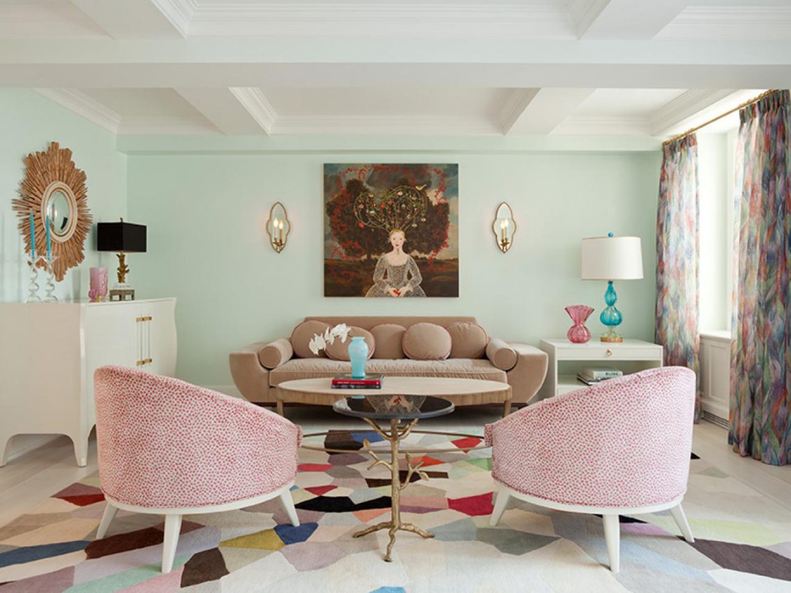
Alternating stripes of bright colors will visually stretch the room upward and make it narrower.
A palette of warm shades is ideal for darkened and cold rooms. Selecting cool tones will make the room less bright and warm.
You need to combine colors in the interior, guided by your preferences, without being afraid to experiment. If you can’t find the desired combination, it is recommended to distract yourself for a while and walk around the house. You should imagine the future design in detail. Can be painted in desired colors large sheets paper and attach them to the walls and furniture. This will help determine which color is best to choose for the kitchen or bedroom. 
Color combinations in the interior need to be carefully thought out before execution. repair work. If the decor doesn't live up to expectations, it will be much more difficult to change it.
Photo gallery
You can view 59 more in our gallery interesting options competent color combination in the interior.
When thinking through the design of any interior, you should carefully select the color scheme. It is she who has a powerful psycho-emotional and energetic influence on a person. Therefore, it is important to choose exactly those colors that will bring harmony to the atmosphere of your home. In this process, it is necessary to correctly use the combination of colors in the interior: a table of harmonious combinations will help turn even an ordinary room into an absolutely flawless place.
When creating a design, you need to start not only from your preferences, but also follow certain rules. Compliance with them will ensure more results high level. Many experts develop on this basis the whole science of coloristic design of premises.

The main supporting points are as follows:
- a correctly chosen base is the foundation for further decoration;
- all colors are divided into two groups - cold and warm colors, which must be taken into account when combining them;
- Warm colors will add coziness to a large room;
- a small area will be visually enlarged due to the cold palette;
- when choosing shades for kitchen design, you should remember the statement that some colors can increase appetite, while others, on the contrary, will suppress it;
- the color palette of the bedroom should promote relaxation - both moral and physical;
- the choice of colors for the living room is selected to satisfy most preferences;
- the choice of style is the determining basis for what colors to use;
- It is advisable to think through everything as thoroughly as possible: color can change the overall picture, both for the better and for the worse.

Style color combinations and their influence on a person’s mood
Each style has its own defining tones, so when using a certain style direction in the design, you should take into account the correspondences given in the table:
| Style | Color |
| Provence | Light pink, milky, blue |
| Eco style | Swampy and brown |
| Baroque | Pastel shades |
| Classical | Mandatory presence of white |
| High tech | Metallic grey, black, white |
| Modern | Brown beige, blue, green |
| Minimalism | Black and white |
| Futurism | White, lemon yellow, ultramarine, light green |
| Pin-up | Light pink and warm yellow |
| Country | Sand, light yellow, brown |
| Loft | Orange, red, blue, green |
Following these dependencies will prevent you from making a serious mistake during the work process.

We should also not forget about the influences exerted by certain colors:
| Hue | Impact on a person's mood |
| Shades of yellow and green | Optimism, calm, tranquility, reduction of fatigue, relaxation |
| Pastel colors of yellow, beige | Creating comfort, peace of mind, making compromise decisions |
| Turquoise | Feeling of lightness and freshness |
| Blue | Calmness, peace, good sleep |
| Yellow and orange | Warmth, comfort, tone of the whole body, stimulation of active areas of the brain |
| White | An excellent background for any design solution, cleanliness, order, inspiration, but its abundance brings coldness to the room |
| Black | Suitable for graphic types of interior, can add gloom and gloominess |
| Grey | Always looks businesslike, regardless of the use of bright accents |
Color wheel of color combinations: basic principle of use
To successfully select the design of any room, use a circle of color combinations. Its structure consists of 12 sectors. Each sector contains one color, or rather all its shades. Graduation occurs from a light tone in the center to a dark tone at the edge of the circle.
The spectrum begins with three primary colors: blue, yellow and red. Further, when they are mixed, secondary shades appear: purple, green and orange. Accordingly, the secondary and primary colors are then mixed, and as a result, tertiary combinations are obtained.

Using this circle you can select color palette several different directions:
- Solid type.
- Complementary combination.
- Harmonious type.
The monochromatic type is based on the use of only one color segment. The combination of colors with each other here occurs from light to dark shades of the same color. This monochrome approach is quite rare. It is not always possible to do without any contrasting inclusions.
The complementary combination gives a very high-quality, bright design. Using colors that are diametrically opposed, small compositions are created, but the necessary accents are very effectively placed. For example, the following pairs are used according to this principle:
- combination of turquoise color in the interior with red;
- combination of purple and yellow-green;
- a combination of green and red-violet in the interior.

Classic combinations: a base of three and four colors
The harmonious type is based on the use of one main, two supporting and one additional - black or white.
The main variation of this approach is the triad. The combination of colors on the color wheel is based on the use of 3 equally spaced colors. In the photo of color combinations in the interior, you can note the choice of one main and 2 supporting shades. Such a connection is often found not only in works made by man, but also in wildlife. This proves the absolute correctness of its use.
As an option, many are considering an analog triad. Take 3 colors located next to each other on the circle. One is the main one, the second is supporting, the third is accentuating. In the future, based on this principle, a very correct design line is built.
Separately, it is necessary to mention the contrasting triad. Here you need to take the main color and find its diametrically opposite one. But in combination with the main thing, add not it, but two colors adjacent to it. The result will be a softer, less flashy use of tones.
Exist the right combination based not only on three colors, which are called triads, but also on four. A rectangular scheme is known in which the colors are complementary in pairs. In this option, 1 is the main one, and the rest are auxiliary. For example, good combinations of beige in an interior with other colors are blue, brown, and emerald.

Another option would be to good decision: Using colors according to the square principle. This action is similar to the previous one, but the only difference is that the colors are equidistant from each other.
Combination of colors in the interior: table, basic rules and directions
To create a fashionable image of your home, you need to have a basic understanding of color combinations. Using the color wheel is not always easy to use. Therefore, they often resort to the help of certain tables, in which you do not need to calculate anything yourself, but everything has already been selected by specialists. Therefore, you can easily determine the most original combination of colors in the interior of the living room or in another room.
Such tables can be presented in the form of a large set of colors, between which the degree of compatibility is noted. Having independently combined two shades, you can already see whether it is worth using them or whether you need to think about a more correct choice.

There are also tables that contain ready-made solutions. This is a collection of four tones that combine most successfully with each other. Using such simple examples You can easily choose the most harmonious option for any room. Their construction is also based on the colors of the color combination circle.
Some charts on the left contain the main base shade arranged vertically. Next, there are several color ranges: possible shades of the same color, possible shades of other colors and several contrasting shades.
Examples of table combinations
The combination of turquoise color in the interior with other shades in the form of ready-made tables can be presented with certain names, such as “summer dreams”, “meeting in a coffee shop”, “lime kiss”, etc. This color is able to softly and unobtrusively highlight the necessary details premises. The variety of its shades from dark azure to delicate aquamarine gives designers a wide field for action.
The combination of green color in the interior can also be found in the form ready-made solutions. If, for example, we take a light green shade, then an excellent result will be obtained when used with eggplant, purple, burgundy, warm yellow and orange shades. Recently, a delicate mint tone has been very popular, which harmonizes perfectly with white, silver and light brown tones.

If you take deep and rich dark green as a basis, then it will already be combined with cool shades of red, lemon yellow. The dark olive shade of the walls is good in combination with the colors of curtains and wallpaper in a dark brown or white shade with contrasting accents of pink.
Using such simple ready-made combination tables, the result of interior designing any room will be very good, even without the additional help of specially trained designers.
Color combinations in the kitchen interior: photos of successful ideas
Well-thought-out components of kitchen design will give the most positive result. Here you need to take into account the decoration of the walls, ceiling, floor, and selected furniture. The main criterion for selecting the above parameters will be the color scheme. In this matter, experts most often come to this decision: if the walls are made in bright, provocative colors, then kitchen furniture should be executed in calm, bed colors. And vice versa.
Registration is often used kitchen sets"under the tree". In this case good combination flowers in the interior with brown they will give cream, pink, bright blue, green and beige. Based on the choice of such a palette, you can distribute the colors you like between the finishes different parts premises.
Recently, high-tech kitchens have become especially popular. The base color of this design is grey. Despite the fact that it is considered boring and purely businesslike, dark pink, red, purple and bright blue are a wonderful combination of colors with gray in the interior.

Important rules when planning a kitchen interior
Creating a design for a specific line is based on several rules:
- Having chosen the main color and its complementary colors, you should remember that it can look different on different surface textures;
- contrasting colors are very often used for zoning a room;
- in order to diversify plain interior, resort to drawings, lines, geometric shapes.
Related article:
Professional advice for those who do their own repairs. Preparing walls for painting. Selection of trendy colors and textures.

Wanting to have a catchy and slightly defiant design, contrasting colors are used. But when decorating, you always need to feel a fine line, otherwise you may not avoid bad taste. The use of contrasting accents always makes the environment bright and impressive. For example, a combination of blue and metallic colors will highlight black. Even considering that he is deep, strict and sad, he will fit perfectly into this triad.
Helpful advice! The main basis for choosing a palette should be the following thesis: furniture is always darker than the walls, but lighter than the floor.

In addition, you need to remember the following correspondences:
- orange goes with blue and gray;
- red - with white, gray and black;
- yellow - with purple;
- blue - with peach;
- lilac - with green.
After this, the full scale is built. Photos of color combinations also show that glossy surfaces they expand the saturation and depth of tones, while matte ones do the opposite. Using this fact, you can effectively play on the variety of materials offered and achieve the most desired result.
Combination of color with other colors in the living room interior
The directly proportional relationship between the interior and the purpose is conducive to correct selection living room colors. If it is used only for receiving guests and family gatherings, then it would be best to use shades that promote long-term communication, leisurely and naturally flowing relaxation, and a fun event. This room sets the overall balance of beauty and comfort in the house, and therefore requires increased attention when decorating.

Helpful advice! Red tones with gold will give you a feeling of celebration, green and olive will give you a craving for intellectual games and reading. The color combination of purple and, for example, gray will set certain accents and enliven friendly gatherings.
But the central room of a house or apartment cannot always be used only for its intended purpose. Very often, it also advantageously combines the functions of a bedroom.
In this case, the owners have to find the ideal compromise in design solution. Depending on your temperament, you can choose good options. However, we should not forget about the influence of color on sleep and rest. More restrained tones, combinations of beige in the interior, turquoise, lavender, emerald and azure will give a feeling of complete relaxation in the bedroom and at the same time will look harmonious in the living room.

If the walls are beige, the combination of colors in the living room interior will be an easy choice for the owners. After all, the basic beige shade is the ideal basis for almost any color scheme. You can choose a lot of options in any direction. This approach is very often used due to its versatility. In a situation where one room is used for different functional loads, it requires clear zoning.
To avoid unnecessary overloading of space with various racks, niches or screens, it would be correct to use a color palette to distribute the territory. This tactic is very often applicable and is famous for good feedback about itself. After all, how nice it is to be in a room in which everything is free and at the same time clearly structured.
Photos of wallpaper combinations of two colors in the living room clearly demonstrate the possibility of zoning a room to increase its functionality. And at the same time gives it a special feature. Beautifully selected tones with this technique will make the interior original.
Color combinations in the bedroom interior: colors and successful combinations
It's no secret that good proper rest is the key to health. To ensure this important part of every person’s life, a room is required that best satisfies his individual needs.

It is necessary to design it so that it is comfortable, pleasant and conducive to relaxation. A table of color combinations in the interior will give you the opportunity to choose the right options. Depending on personal preferences, cold or warm tones are used, often resorting to the so-called color bleaching. This practice makes your favorite bright, flashy shade more suitable for the rest room.
When choosing, you need to remember that the number of colors cannot exceed 7, while everything is taken into account: the color of the ceiling, furniture, accessories, etc. The percentage of bright colors is 10. The more colors there are for decoration, the less bright they should be .
Bright style in the bedroom: the right tone solution
A photo of color combinations in a bedroom interior shows that using even deep red color is good for creating modern design. This option will appeal to people with an active lifestyle. If you diversify this color a little, you can get a very different one. fashionable look, which is based on a terracotta shade.

Based on these tones, many often resort to using golden touches. Very good result will give a tandem of red and dark green. The combination of gold and brown will add depth and importance to the bedroom.
If you like the color red, but want more calm atmosphere, then you can safely use scarlet or ocher color. By combining with basic pastel colors you can achieve bright accent, and godly depth.
Use the color of cheerfulness and fun - orange - in the bedroom with caution. It is suitable for many active and mobile people. Related tones such as pumpkin or tangerine are ideal for the dominant color. Look good in combination with ivory or beige.
If the choice clearly fell on the color yellow, then you need to approach the issue very carefully. Specialists from design companies do not recommend using it as a local one. It would be best to use a pear or corn shade.

Peace in the bedroom: how to achieve it with color
Most people tend to perceive the bedroom as a center of calm and tranquility, so they do not use bright colors when decorating it. rich colors. The choice most often falls on pastel colors. They contribute to practical rest and full restoration of physical and emotional strength.
Blue color is ideal for decorating recreation rooms. It is boldly associated with water and its natural purity. According to the color combination table, it looks good with natural shades of wood and beige.
A surge of vigor and purity of thoughts will be fully ensured by green color. Using it as a base when decorating a room, you can easily achieve this effect. To prevent the room from seeming a little boring or gloomy, you can combine this color with neutral shades such as white or light beige.
Combination Brown in an interior with beige, green or purple it will add some mystery. The room will be cozy and calm. It is the brown shade that is chosen as a priority, and the rest will play a supporting role.

Many pastel shades go very well together because they complement each other. Beige, cream and apricot carry positive energy. They often act as the basis of a design line and are well set off by other colors that act as bright contrasting accents.
A high-tech style solution will be a combination of colors with gray in the interior. It would look perfect with the aforementioned red. It has become very common lately to combine gray and lilac flowers. Such a combination will be perfectly set off by a furniture set in white or dark brown.
The gray shade itself can play a dual role in any design. Where necessary he will emphasize the brightness of another, and where necessary he can dim it. Colors such as blue, green, pink or beige will also help him create a comfortable atmosphere in the bedroom.

Note! The combination of gray color in the interior fits well into various style solutions. That is why it is in great demand among owners of modern apartments.
The combination of colors in the bedroom interior can be different, but there are also moments that should be avoided. For example, contrasting solutions are a little inappropriate. Options such as orange and purple, yellow and blue, green and purple are not suitable for the interior of a relaxation room. Their combinations are very colorful and provocative, and will not give you the opportunity to relax and unwind. Therefore, thinking through each step, you need to correctly analyze the situation and choose harmonious combinations.