What could be more important than harmony? After all, translated from ancient Greek language, harmony is coherence, proportionality and order. Therefore, all this must be present in interior design. Plays a huge role in design the right combination colors and their shades. Every experienced designer knows that the color scheme is most important factor formation of a person’s perception of the world, therefore the main task is to correctly select color palette. After all, each color is individual, therefore, working with it should have an individual approach. In this article you will find everything related to color harmony, and most importantly, you will learn what rules must be followed when combining different shades.
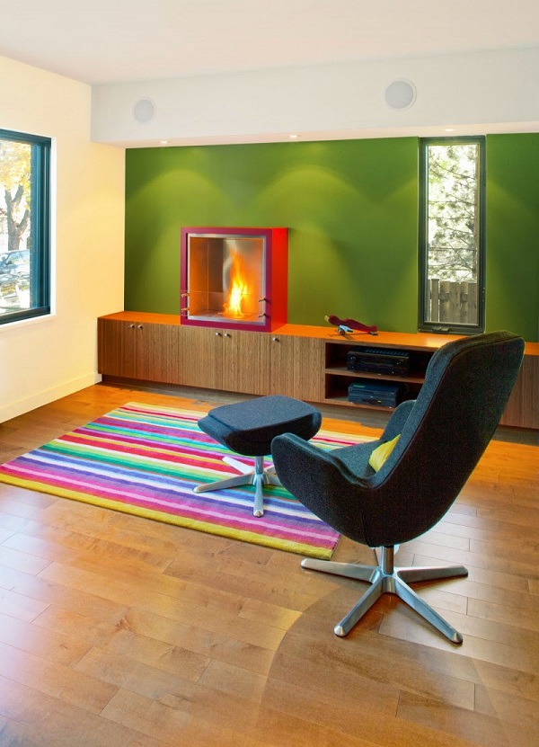
Stylish interior in the right shades
Color, as you know, plays a huge role in decorating rooms, color schemes and creating a single color theme. Therefore, by changing color scheme, for example, your room, it will take on a completely different appearance. The room may change beyond recognition. For example, space can visually increase or, conversely, decrease. Therefore, it is extremely important to be able to correctly combine the palette to create any interior.
In order for you to feel comfortable in the space you create, it is imperative to choose a color scheme that reflects the entire essence of your character. Therefore, the choice of color palette should be approached carefully and thoroughly, and also take into account a number of features that, to one degree or another, influence a person. Only by following all the rules you are guaranteed to be satisfied with the result.


First, you should decide on your desires: do you want to create a festive mood or, on the contrary, choose calmer, warmer colors, smooth lines for peace and relaxation. After the decision has been made, you should proceed to the most important thing - choosing and the right combination of colors.


Let's talk in more detail about color
It's no secret that all colors and their shades are divided into warm and cold. Orange is considered the warmest color. The coldest is blue. This is evidenced by an experiment conducted under special conditions, which revealed that people who were in an orange room complained of cold much less often than those who were in a blue room.
Successfully combining orange with others is not so easy. All this is because it does not have cold shades, as a result of which it is suitable only for a narrow range of colors. Orange goes best with yellow, cream and peach.


The color blue is usually associated with coolness and water. All shades of blue are more conducive to rest and relaxation than shades of yellow. After all, warm colors, on the contrary, are conducive to activity and fun. And therefore, many may think that warm colors do not go well with cold ones. But this is absolutely not true. It is on this combination that many design ideas are built.
Blue- an indicator of reliability, strength and confidence. Having a series in my head fresh ideas, creating a light and relaxed atmosphere using this color will not be difficult.


How to combine different colors without disturbing the overall harmony
If you want to visually expand the room and make it more comfortable, you need to combine cold shades with warm ones. Meanwhile in various rooms we want to feel different. For example, in the living area you want comfort and tranquility, in the dining room or kitchen you want to create an environment that has a beneficial effect on pleasant communication and a good appetite.
In the bedroom we want to relax and take a break from the everyday hustle and bustle. If your goal is to get a noble interior that will be the personification of tranquility, pay attention to gray And .


Combination of gray and white in the bedroom - a classic of the genre

Let's talk a little more about the bedroom. In order to get a better night's sleep, you need to relax well and fall asleep quickly. To do this, experts advise using shades of blue and other cool colors. But on the other hand, it is also believed that it is the red color that gives people more strength and energizes them.
From here, only one conclusion can be drawn: the most important thing is that you like the chosen color, so that it does not hurt your eyes or burden the decor, otherwise you simply will not be able to stay in the room for a long time.


If it’s difficult for you to choose the right shade yourself, you can resort to the services of a designer who does this intuitively, or use special tables where you select optimal combination flowers in the interior. Considering your wishes and fashion trends, using this table you can choose the ideal option for yourself.
Let's consider several approaches to choosing color solutions
- The first approach is to select the tone of the desired color. That is, the color can be more or less saturated. Don’t be upset if the desired color doesn’t seem so expressive to you, and the room seems faded. Don't rush to add brightness to the colors. It’s better to complement the room with contrasting details.
- The second approach is to select several colors that would fit perfectly together. As a result, it turns out perfect, harmonious design. The most important thing in this approach is a sense of proportion and healthy sense.
If such abilities are not yet as well developed as those of designers, then you can use this picture, which clearly shows the optimal combination of color palette:

The most mysterious organ human body- this is the eye. After all, he is able to distinguish up to one and a half million shades. Some people do not attach due importance to colors and their shades. But this is their delusion. All this happens inside us, and our brain reacts to every color.
Each color leaves its mark on our well-being, behavior, emotional state. Therefore, you should be more careful about some unfavorable colors. Let's talk about them.
- For example, the color red most often contributes to the development of anxiety and nervous tension;
- Be careful with purple and black. They can visually make your room smaller;
- Brown color can put you into a state of melancholy or depression;
- Blue color, as mentioned above, is associated with cold. Therefore, it will be very difficult to create comfort in a room where only blue shades predominate;
- Gray color will never give joy and fun, but only the opposite - a sad mood and despondency.


But don’t despair, because there are many other colors that can be safely used in the interior. Colors that give a feeling of happiness, joy, create comfort and coziness. Here are some of them:
With the help of beige and warm shades of yellow, you can easily create coziness and comfort in your room. Decorate the interior using these tones and you will create a calm and romantic atmosphere in the interior.


Green and yellow also promote relaxation, uplifting, and calmness. Turquoise color is ideal for the bathroom, as it is the personification of freshness and cleanliness.


The blue color is very calming, promotes good rest, and sometimes even induces sleep. Therefore, most often in bedrooms, this color is used. But in offices and where vigor and freshness are needed, it is not recommended to use blue.


Orange and yellow colors give extraordinary energy, good mood, encourage people to communicate and give a feeling of warmth, which is important in cool rooms. In addition, yellowness has a positive effect on the mental activity of the brain, causing it to work more productively.
The first associations with yellow are summer, sun and beach. And such sensations cannot but cause a storm positive emotions. Therefore using this combination flowers will always put you in a summer mood.


The best color to go with yellow is blue

White color is generally considered neutral. But if there is too much of it, unpleasant sensations may appear that irritate the eye. However, if an experienced designer gets down to business, then you don’t have to worry about anything.
Gray color promotes performance. It is good to use both at home and in offices and work areas. If you use black correctly, for example, add some accents, you can end up with a very elegant design;

Colors in the interior are of key importance, try to do it so that you feel truly comfortable in it

Red color can lift your spirits, give you vigor and emotional excitement, while pink is conducive to calm, tenderness and relaxation.
If you are afraid to overdo it with pink and do not want it to become the dominant shade in your interior, use upholstered furniture, light and sheer curtains, beautiful decorative pillows and other decorative elements in rainbow colors.


From everything we have read, we can conclude that each color is individual and good in its own way. Therefore, in order to create the desired coziness and comfort in the room, it is necessary that you like the chosen colors and do not cause the slightest discomfort.
For the rest, our tips on how to get the optimal combination of popular shades will help you.
Creating the design of any space begins with color. Having decided on the general style of the room, the designer already imagines it in certain colors, since they are the ones who direct the imagination into the right direction. The combination of colors in interior design is one of the factors indicating the style and theme of the room. Country style is dominated by noble rich tones, all shades of wood, white, beige, burgundy, brown. To create the Provence style, we use pastel colors with a slight splash dark shades. The “marine” style is indicated by blue, white, gray, light blue and the color of dark wood. The classic is characterized by a wide range of beige, chocolate, and coffee. The ethnic style plays with contrasts, using brown, bardo, black, and red. The choice of color solutions is the most important stage on which the success of interior design as a whole depends.
The joke that all men see only 16 colors, as in the default Windows settings, has real roots: there are many more “color-sensitive” cells in a woman’s eye.
However, as research shows, the human eye is capable of perceiving a huge number of colors and their shades: about 250 pure and more than 10 million mixed.
A simple understanding of the colors of the main spectrum will help you not to get lost in such diversity.
There are only seven of them: red, orange, yellow, green, blue, indigo, violet. Taking these colors as a basis, diluting them or mixing them with each other, colorists create a huge number of tones and shades for use in the interior. To them are added so-called achromatic colors, that is, those that do not carry any color meaning. There are only three of them: black, white, gray.
All colors can be divided into two groups: warm and cold:
The feeling of warmth is caused by red, orange, yellow, and all their various shades. Warm colors are used to make a room more comfortable, add light to a poorly lit room, or correct too much empty space.
The feeling of coolness is evoked by blue, violet, cyan and their various tones. Cool colors are suitable for well-lit rooms, they will visually expand the space and add freshness and vigor.
How to choose the right harmonious combination of colors in interior design?
Choosing colors and their combinations is a complex process that sometimes baffles even professional designers. But with the help of a universal, easy-to-use color wheel, anyone can now cope with the correct selection of colors. You just need to remember that within one room you should combine from three to five colors, no more.
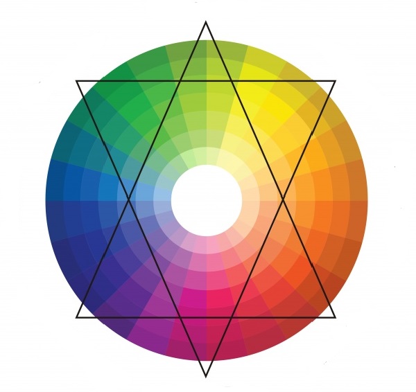
Color wheel
1) Several shades of the same color
This is a proven and reliable method for calm natures who do not like to take risks too much. The room is “filled” with all sorts of shades of the same color: from the deepest, most saturated to the lightest, barely visible. Smooth transitions and a guaranteed successful combination will give the interior calm, harmony, and tranquility.
2) Playing on contrasts
A method radically opposite to the previous one. The basis is taken of two contrasting colors located opposite each other on the color wheel. Contrasts are played out in the interior using neutral colors such as black, white, gray.
3) Harmonious combinations
One of the colors in which you would like to decorate the room is taken as a basis. Two more are “attached” to it, located to the left and right of it on the color wheel. In this case, the colors will form an original and beautiful combination, without sharp transitions.
4) Three spectacular colors
A somewhat bolder move, but without being too flashy. A triangle is used to identify three colors that successfully combine with each other. It can be rotated within the circle until the angles indicate the most pleasing combination to the eye for each individual case.
Rules for choosing colors for different rooms
The influence of color on a person’s mood and emotions has not been a discovery for a long time. That is why you should very carefully select colors for interior decoration, depending on the purpose of the room.
Bedroom
It is not recommended to decorate the bedroom with sharp contrasting colors, since this place is designed to relax and soothe. Pastel colors and soft shades are perfect here. Warm colors are preferable, but cool shades can also be used if the room is small and the windows face south. Well-chosen accessories, the addition of white, and the correct placement of accents will help bring coziness to cold tones.
Living room
In the interior of the living room, you can be bolder with the choice of colors. Playing with contrasts or using catchy accents will add vigor and give the interior a stylish, effective look. If the windows face north, you should take warm shades as the basis for the interior. If the living room is too small, you can “expand” it a little by using a light, cool palette. It is important to consider that cool tones are only good for bright rooms where the sun does not leave the room for a long time.

When thinking through the design of any interior, you should carefully select the color scheme. It is she who has a powerful psycho-emotional and energetic influence on a person. Therefore, it is important to choose exactly those colors that will bring harmony to the atmosphere of your home. In this process, it is necessary to correctly use the combination of colors in the interior: a table of harmonious combinations will help turn even an ordinary room into an absolutely flawless place.
Basic rules for combining colors with other colors in the interior
When creating a design, you need to start not only from your preferences, but also follow certain rules. Compliance with them will ensure more results high level. Many experts develop on this basis the whole science of coloristic design of premises.

The main supporting points are as follows:
- a correctly chosen base is the foundation for further decoration;
- all colors are divided into two groups - cold and warm colors, which must be taken into account when combining them;
- Warm colors will add coziness to a large room;
- a small area will be visually enlarged due to the cold palette;
- when choosing shades for kitchen design, you should remember the statement that some colors can increase appetite, while others, on the contrary, will suppress it;
- the color palette of the bedroom should promote relaxation - both moral and physical;
- the choice of colors for the living room is selected to satisfy most preferences;
- the choice of style is the determining basis for what colors to use;
- It is advisable to think through everything as thoroughly as possible: color can change the overall picture, both for the better and for the worse.

Style color combinations and their influence on a person’s mood
Each style has its own defining tones, so when using a certain style direction in your design, you should take into account the correspondences given in the table:
| Style | Color |
| Provence | Light pink, milky, blue |
| Eco style | Swampy and brown |
| Baroque | Pastel colors |
| Classical | Mandatory presence of white |
| Hi-tech | Metallic grey, black, white |
| Modern | Brown beige, blue, green |
| Minimalism | Black and white |
| Futurism | White, lemon yellow, ultramarine, light green |
| Pin up | Light pink and warm yellow |
| Country | Sand, light yellow, brown |
| Loft | Orange, red, blue, green |
Following these dependencies will prevent you from making a serious mistake during your work.

We should also not forget about the influences exerted by certain colors:
| Hue | Impact on a person's mood |
| Shades of yellow and green | Optimism, calm, tranquility, reduction of fatigue, relaxation |
| Pastel colors of yellow, beige | Creating comfort, peace of mind, making compromise decisions |
| Turquoise | Feeling of lightness and freshness |
| Blue | Calmness, peace, good sleep |
| Yellow and orange | Warmth, comfort, tone of the whole body, stimulation of active areas of the brain |
| White | An excellent background for any design solution, cleanliness, order, inspiration, but its abundance brings coldness to the room |
| Black | Suitable for graphic types of interior, can add gloom and gloominess |
| Grey | Always looks businesslike, regardless of the use of bright accents |
Color wheel of color combinations: basic principle of use
To successfully select the design of any room, use a circle of color combinations. Its structure consists of 12 sectors. Each sector contains one color, or rather all its shades. Graduation comes from light tone in the center and to dark at the edge of the circle.
The spectrum begins with three primary colors: blue, yellow and red. Further, when they are mixed, secondary shades appear: purple, green and orange. Accordingly, the secondary and primary colors are then mixed, and as a result, tertiary combinations are obtained.

Using this circle you can choose a color palette in several different directions:
- Solid type.
- Complementary combination.
- Harmonious type.
The monochromatic type is based on the use of only one color segment. The combination of colors with each other here occurs from light to dark shades of the same color. This monochrome approach is quite rare. It is not always possible to do without any contrasting inclusions.
The complementary combination gives a very high-quality, bright design. Using colors that are diametrically opposed, small compositions are created, but the necessary accents are very effectively placed. For example, the following pairs are used according to this principle:
- combination turquoise color in the interior with red;
- combination purple with yellow-green;
- a combination of green and red-violet in the interior.

Classic combinations: a base of three and four colors
The harmonious type is based on the use of one main, two supporting and one additional - black or white.
The main variation of this approach is the triad. The combination of colors on the color wheel is based on the use of 3 equally spaced colors. In the photo of color combinations in the interior, you can note the choice of one main and 2 supporting shades. Such a connection is often found not only in works made by man, but also in wildlife. This proves the absolute correctness of its use.
As an option, many are considering an analog triad. Take 3 colors located next to each other on the circle. One is the main one, the second is supporting, the third is accentuating. In the future, based on this principle, a very correct design line is built.
Separately, it is necessary to mention the contrasting triad. Here you need to take the main color and find its diametrically opposite one. But in combination with the main thing, add not it, but two colors adjacent to it. The result will be a softer, less flashy use of tones.
There are correct combinations based not only on three colors, which are called triads, but also on four. A rectangular scheme is known in which the colors are complementary in pairs. In this option, 1 is the main one, and the rest are auxiliary. For example, good combinations of beige in an interior with other colors are blue, brown, and emerald.

Another option will lead to a good solution: using colors according to the square principle. This action is similar to the previous one, but the only difference is that the colors are equidistant from each other.
Combination of colors in the interior: table, basic rules and directions
To create a fashionable image of your home, you need to have a basic understanding of color combinations. Using the color wheel is not always easy to use. Therefore, they often resort to the help of certain tables, in which you do not need to calculate anything yourself, but everything has already been selected by specialists. Therefore, you can easily determine the most original combination of colors in the interior of the living room or in another room.
Such tables can be presented in the form of a large set of colors, between which the degree of compatibility is noted. Having independently combined two shades, you can already see whether it is worth using them or whether you need to think about a more correct choice.

There are also tables that contain ready-made solutions. This is a collection of four tones that combine most successfully with each other. Using such simple examples You can easily choose the most harmonious option for any room. Their construction is also based on the colors of the color combination circle.
Some charts on the left contain the main base shade arranged vertically. Next, there are several color ranges: possible shades of the same color, possible shades of other colors and several contrasting shades.
Examples of table combinations
The combination of turquoise color in the interior with other shades in the form of ready-made tables can be presented with certain names, such as “summer dreams”, “meeting in a coffee shop”, “lime kiss”, etc. This color is able to softly and unobtrusively highlight the necessary details premises. The variety of its shades from dark azure to delicate aquamarine gives designers a wide field for action.
The combination of green color in the interior can also be found in the form ready-made solutions. If, for example, we take a light green tint, then excellent result will work when used with eggplant, purple, burgundy, warm yellow and orange shades. Recently, a delicate mint tone has been very popular, which harmonizes perfectly with white, silver and light brown tones.

If you take deep and rich dark green as a basis, then it will already be combined with cool shades of red, lemon yellow. The dark olive shade of the walls is good in combination with the colors of curtains and wallpaper in a dark brown or white shade with contrasting accents of pink.
Using such simple ready-made combination tables, the result of interior designing any room will be very good, even without the additional help of specially trained designers.
Color combinations in the kitchen interior: photos of successful ideas
Well-thought-out components of kitchen design will give the most positive result. Here you need to take into account the decoration of the walls, ceiling, floor, and selected furniture. The main criterion for selecting the above parameters will be the color scheme.
In this matter, experts most often come to this decision: if the walls are made in bright, provocative colors, then kitchen furniture should be executed in calm, bed colors. And vice versa.
Registration is often used kitchen sets"under the tree" In this case, a good combination of colors in the interior with brown they will give cream, pink, bright blue, green and beige. Based on the choice of such a palette, you can distribute the colors you like between the finishes different parts premises.
Recently, high-tech kitchens have become especially popular. The base color of this design is grey. Despite the fact that it is considered boring and purely businesslike, dark pink, red, purple and bright blue are a wonderful combination of colors with gray in the interior.

Important rules when planning a kitchen interior
Creating a design for a specific line is based on several rules:
- Having chosen the main color and its complementary colors, you should remember that it can look different on different surface textures;
- contrasting colors are very often used for zoning a room;
- in order to diversify plain interior, resort to drawings, lines, geometric shapes.
Related article:
Painting walls in an apartment: design, photo examples, fashion trends, advice from professionals
Professional advice for those who do their own repairs. Preparing walls for painting. Selection of trendy colors and textures.

Wanting to have a catchy and slightly defiant design, contrasting colors are used. But when decorating, you always need to feel a fine line, otherwise you may not avoid bad taste. The use of contrasting accents always makes the environment bright and impressive. For example, a combination of blue and metallic colors will highlight black. Even considering that he is deep, strict and sad, he will fit perfectly into this triad.
Useful advice! The main basis for choosing a palette should be the following thesis: furniture is always darker than the walls, but lighter than the floor.

An example of using the main turquoise tone and two complementary light yellow and blue
In addition, you need to remember the following correspondences:
- orange goes with blue and gray;
- red - with white, gray and black;
- yellow - with purple;
- blue - with peach;
- lilac - with green.
After this, the full range of kitchen colors is built. Photos of color combinations also show that glossy surfaces they expand the saturation and depth of tones, while matte ones do the opposite. Using this fact, you can effectively play on the variety of materials offered and achieve the most desired result.
Combination of color with other colors in the living room interior
The directly proportional relationship between the interior and the purpose encourages the correct selection of colors for the living room. If it is used only for receiving guests and family gatherings, then it would be best to use shades that promote long-term communication, leisurely and naturally flowing relaxation, and a fun event. This room sets the overall balance of beauty and comfort in the house, and therefore requires increased attention when decorating.

Useful advice! Red tones with gold will give you a feeling of celebration, green and olive will give you a craving for intellectual games and reading. The color combination of purple and, for example, gray will set certain accents and enliven friendly gatherings.
But the central room of a house or apartment cannot always be used only for its intended purpose. Very often, it also advantageously combines the functions of a bedroom.
In this case, the owners have to find the ideal compromise in design solution. Depending on your temperament, you can choose good options. However, we should not forget about the influence of color on sleep and rest. More restrained tones, combinations of beige in the interior, turquoise, lavender, emerald and azure will give a feeling of complete relaxation in the bedroom and at the same time will look harmonious in the living room.

If the walls are beige, the combination of colors in the living room interior will be an easy choice for the owners. After all, basic beige shade– the ideal base for almost anyone color scheme. You can choose a lot of options in any direction. This approach is very often used due to its versatility.
In a situation where one room is used for different functional loads, it requires clear zoning.
To avoid unnecessary overloading of space with various racks, niches or screens, it would be correct to use a color palette to distribute the territory. This tactic is very often applicable and is famous for good feedback about itself. After all, how nice it is to be in a room in which everything is free and at the same time clearly structured.
Photos of wallpaper combinations of two colors in the living room clearly demonstrate the possibility of zoning a room to increase its functionality. And at the same time gives it a special feature. Beautifully selected tones with this technique will make the interior original.
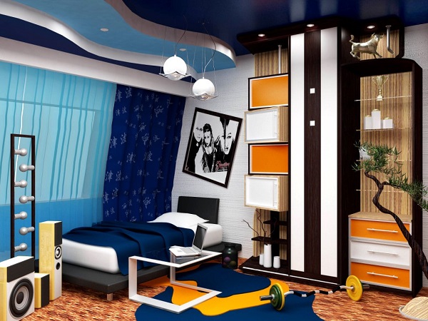
Color combinations in the bedroom interior: colors and successful combinations
It's no secret that good proper rest is the key to health. To ensure this important part of every person’s life, a room is required that best satisfies his individual needs.

The bedroom design must be developed so that it is comfortable, pleasant and conducive to relaxation. A table of color combinations in the interior will give you the opportunity to choose the right options. Depending on personal preferences, cold or warm tones are used, often resorting to the so-called color bleaching. This practice makes your favorite bright, flashy shade more suitable for the rest room.
When choosing, you need to remember that the number of colors cannot exceed 7, while everything is taken into account: the color of the ceiling, furniture, accessories, etc. The percentage of bright colors is 10. The more colors there are for decoration, the less bright they should be .
Bright style in the bedroom: the right tone solution
A photo of color combinations in a bedroom interior shows that using even deep red color is good for creating modern design. This option will appeal to people with active life position. If you diversify this color a little, you can get a very different one. fashionable look, which is based on a terracotta shade.

Based on these tones, many often resort to using golden touches. Very good result will give a tandem of red and dark green. The combination of gold and brown will add depth and importance to the bedroom.
If you like the color red, but want more calm atmosphere, then you can safely use scarlet or ocher color. By combining with basic pastel colors you can achieve bright accent, and godly depth.
Use the color of cheerfulness and fun - orange - in the bedroom with caution. It is suitable for many active and mobile people. Related tones such as pumpkin or tangerine are ideal for the dominant color. Look good in combination with ivory or beige.
If the choice clearly fell on the color yellow, then you need to approach the issue very carefully. Specialists from design companies do not recommend using it as a local one. It would be best to use a pear or corn shade.

It is worth noting that yellow is the color of vivacity, so it is not recommended to use it to decorate the bedroom for people with sleep problems
Peace in the bedroom: how to achieve it with color
Most people tend to perceive the bedroom as a center of calm and tranquility, so they do not use bright colors when decorating it. rich colors. The choice most often falls on pastel colors. They contribute to practical rest and full restoration of physical and emotional strength.
Blue color is ideal for decorating recreation rooms. It is boldly associated with water and its natural purity. According to the color combination table, it looks good with natural shades of wood and beige.
A surge of vigor and purity of thoughts will be fully ensured by green color. Using it as a base when decorating a room, you can easily achieve this effect. To prevent the room from seeming a little boring or gloomy, you can combine this color with these neutral shades like white or light beige.
The combination of brown in the interior with beige, green or purple will add some mystery. The room will be cozy and calm. It is the brown shade that is chosen as a priority, and the rest will play a supporting role.

Many pastel shades go very well together because they complement each other. Beige, cream and apricot carry positive energy. They often act as the basis of a design line and are well set off by other colors that act as bright contrasting accents.
A high-tech style solution will be a combination of colors with gray in the interior. It would look perfect with the aforementioned red. It has become very common lately to combine gray and lilac flowers. Such a combination will be perfectly set off by a furniture set in white or dark brown.
The gray shade itself can play a dual role in any design. Where necessary he will emphasize the brightness of another, and where necessary he can dim it. Colors such as blue, green, pink or beige will also help him create a comfortable atmosphere in the bedroom.

Pay attention! The combination of gray color in the interior fits well into various style solutions. That is why it is in great demand among owners of modern apartments.
The combination of colors in the bedroom interior can be different, but there are also moments that should be avoided. For example, contrasting solutions are a little inappropriate. Options such as orange and purple, yellow and blue, green and purple are not suitable for the interior of a relaxation room. Their combinations are very colorful and provocative, and will not give you the opportunity to relax and unwind. Therefore, thinking through each step, you need to correctly analyze the situation and choose harmonious combinations.
Few people attach importance to color, although it has a pretty good effect on people. Therefore, everyone needs to know the combination of colors in the interior, the table of which is given in the article. After all, with the help of color it is possible to create beautiful visual effects, surprising others, and also bring a special psychological atmosphere to your own home. Thanks to this, it will be much easier to win over your guests and charge them with positive emotions for a long time.
Psychology of color
Every person on our own creates around himself an environment that will affect his psyche and health in general. In order to simplify the task, experts have compiled a clear formula, called the “table of color combinations in the interior” (photo can be seen below).
Proper use should be considered when choosing both the main tones of the room and additional ones. The colors that surround us should reflect the characteristics of a person’s character, since only thanks to this does living in own home it will become much more comfortable.
People are able to perceive this or that color both with their eyes and with their whole body. As you know, tone determines our mood, has a good effect on our health, and can also improve or worsen our well-being. Even in ancient times, it was believed that color, with its correct selection, can cure any ailment. Even in the Land of the Rising Sun they often used the healing powers of certain flowers.
Color options
Thus, the table of color combinations in the kitchen interior recommends using a purple tone, since it is extremely closely related to creativity and can force a person to develop his own imagination. He is the first assistant in the event of a pessimistic mood, in those moments when faith is lost and despair sets in.
White color has a connection with spirituality. Thanks to it, we can gain confidence, although we should not forget that being in a room of this color for a long time can dramatically change a person’s self-esteem. He quickly begins to feel some kind of inferiority or, conversely, superiority over everyone else.

It can improve the circulatory system. It affects blood circulation and also has unique property, which consists of activating the growth of red blood cells. This color makes it work nervous system and promotes the production of adrenaline and increased blood pressure.
In a room decorated in yellow color, all the bad moments are instantly forgotten. Here you can get enough energy and gain a sense of protection. In addition, color helps improve the functioning of the digestive system and activate cognitive processes.
For the purpose of reconciliation, you can use green tones. This color calms and brings people together. One of its main advantages is the fact that people suffering from claustrophobia will feel much better in a room with a predominance of green color. Additionally, it treats lung related diseases and flu faster than some medications.
Blue color allows our consciousness to leave the framework of reality and plunge into the world of dreams and thoughts about something distant. The tone allows us to relax; it perfectly helps those suffering from insomnia, frequent stress, migraines, and so on.

Few people love brown, but its benefits are important to almost every person. It makes people who succumb to public opinion and lack self-esteem more decisive and persistent. Thanks to it, a melancholic mood is created, joy appears, and all the bad things are forgotten.
Theories of color combinations
The combination of colors in the interior, the table of which helps to clearly determine correct formula The choice of tone for a particular room is determined by theories. They are combination methods, that is, formulas that have been carefully designed to find colors. At the moment, there are several theories, but the most common of them are the color wheel, as well as its antipode, which are discussed below.

Color wheel
As you know, the combination of colors in the interior (the table is provided below) is based on three primary colors:
- red;
- yellow;
- blue.
They can be mixed to create additional tones, for example:
- violet (blue and red);
- green (blue and yellow);
- orange (yellow and red).
When you connect the main ones and you can get an auxiliary one. Based on this, a color wheel is obtained, where the following colors are present:
- adjacent - located next to each other (example: green, light green and yellow);
- monochrome - are shades of only one color, located on a straight line, with light tones closer to the center and dark tones towards the edge;
- complementary - colors that are clearly on the opposite side (example: blue and orange).

The main thing is to correctly navigate this issue and choose perfect combination flowers in the interior. The table (green and other colors are also presented in it) will help you do this. You can select using the following formulas:
- Triadic combination. To do this, as a rule, three colors are taken, located in a circle at an equal distance from each other.
- Divided complementary circuit. There are also three colors here, but they are selected using a different formula. The primary color is taken first, followed by its complementary color, which, in turn, is divided into two tones located at an equal distance from it (to the right and to the left).
- Double split complementary circuit. There are already four colors in this color scheme. The first step is to select two main ones, and then two complementary to them.
Antipode
Individual and overly bright personalities will be ideally suited to a paired combination of colors in the interior. The table includes brown and similar tones, of course, but they are used extremely rarely. As a rule, businessmen or simply creative people decorate their workplaces with such shades.

Antipode is a choice of a pair of primary colors, which must contrast with each other. These are the following combinations (in the circle they are all complementary):
- pink - light green;
- green - red;
- black - white;
- lilac - yellow.
Now it’s clear how to use tables and what a color combination in the interior is. The table given above - the color wheel - undoubtedly helps in choosing a tone. But in addition to this, it is also necessary to take into account the recommendations of specialists, guaranteeing an excellent result.
The best option to choose the ideal combination of colors in the interior is a table. Beige color, as an example, fits absolutely any room. Therefore, most people, not knowing which color to choose for a particular room, pay attention to it.
It is not always easy to choose a combination of colors in the interior. Table ( lilac tone separately given below) contains many colors, among which there are also universal ones. But when faced with a dilemma, you should not choose tones at random. It is recommended to use no more than four colors in one room.

Incompatible colors
Colors that should never be used together are also included in the basic rules showing the correct combination of colors in the interior. The table (gray color is necessarily present there) of tones that are not compatible with each other is also important.
Experts advise avoiding pairing cool, light shades with warm, dark shades. In addition, a combination of cold dark and warm colors should not be allowed. light colors. Today they allow the combination of incompatible things, so lovers of creativity can combine any shades they like. But still, you should pay attention to the table of incompatible colors:

The principle of monochromatic selection
There are options for choosing a gamma only within only color. A table is not required for this, since different shades of the same primary color always combine with each other. For example, a green tone that can be used in any room would be ideal. After all, greenery can calm you down and help you organize a productive vacation.
Color contrast versus harmony
The ideal combination is This interior will be a winner in any case, since these colors complement each other perfectly. Most often, this combination is used in children's rooms or living rooms. will remind you of sunshine and warmth, thanks to which the house will be filled with an atmosphere of hospitality and kindness. In the kitchen, it will be enough to adapt some accessories of these colors in order to awaken the desire to prepare delicious and creative dishes.
Most people intuitively feel harmonious combination shades different colors. Only a few people care if in a room with pink walls stands poisonously green. Most likely, these people suffer from visual impairment. good color combination speaks about the taste of the owner of the tenant and, in many ways, about his character. , everything should be thought through carefully. A table of color combinations in the interior and knowledge of some design secrets will be useful, about which more details can be found in this material.
Color harmony is the key to a successful interior
There are seven primary colors, these are the colors of the rainbow. In smooth transitions and shades, only liquid crystal screens are capable of reproducing sixteen million colors, and one and a half to two times more are available to human perception. Here you can get confused, what to do? How to choose from such a gigantic palette successful combinations and what should I avoid? It turns out that everything is not so complicated.

Psychologists, not without reason, claim that colors can influence the mental and even physical health person. Eastern scientists successfully practiced healing patients with serious illnesses with color.
The colors you choose to design your room should match your personality. For example, it represents spirituality and confidence.

But red is indicated for people with blood problems. It helps increase the number of red blood cells.

There is only one conclusion - you should not rely on only one color scheme. It is necessary to create a harmonious color combination that has a beneficial effect on the nervous system and well-being.
Types of colors
The entire variety of flowers in nature is divided into three subgroups:
- main – blue, red and yellow;
- secondary - the result of mixing primary colors: green, orange and the like;
- tertiary - the result of mixing secondary and primary colors, for example, emerald.
But white and black are not conventionally considered colors, since they do not occur in natural conditions.

All segments of the circle can be divided into warm and cold shades. It is believed that combining shades of the same “temperature” is ideal.
Another option for selecting a combination is to draw diagonal lines. Here we get, as they say, a unity of opposites.
Color palette of color combinations and some important principles
There are several combination options.
| Monochrome |  | Usage different shades one color. For example, pink - from hot to pale. |
| Achromatic |  | Design in black-white-gray or black and white. The option is not complicated, but rather boring for the interior. |
| Complementary |  | The use of contrasts, sometimes unexpected, but compatible. For example, yellow and purple. |
The black, white and gray color scheme in the interior should be diluted somehow.

Light pastel colors of cold “temperature” can visually increase.
Using contrasting tandems in your design, you should choose one main tone and select other shades to match it. When selecting, you should not get too carried away. Too many colors will make the interior gypsy-colored. This option is not in trend yet.
There are shades that do not tolerate proximity. You should not combine dark hot tones and light cold tones. For example, dark burgundy and. Such tandems can adversely affect the psyche of the occupant of the room.

Examples of combinations in the interior
Using tones of different temperatures and contrasting combinations, you can control your mood and well-being, create a working or romantic atmosphere in the room, a feeling of comfort and coziness. Let's look at examples of photos of color combinations in the interiors of different rooms.
Children's room: everything for the baby's development
There is an opinion that everything should be bright and cheerful. This is not true, or not entirely true. You need to approach the choice of color very responsibly, taking into account the characteristics of the child.

Yellow tones will help you concentrate on your studies, green tones will calm the restless, blue will raise a dreamer, and in a blue room the youngest family member will feel lonely, especially if he does not have a sister or brother.

About the combination of colors in the kitchen interior: photos of delicious options
A successful combination of colors should whet your appetite. The photo shows the most successful combinations:

 Classic pastel colors - universal option

Great mood All shades of orange, yellow and green contribute to increased appetite. For comfort, you should add red and blue, beige. But too saturated tones can cause the opposite effect - discourage appetite.
Be careful with the living room
- a place where, as a rule, the whole family and guests gather. Here you should choose colors not according to individual preferences, but rather universal shades that will not cause discomfort to anyone. For this reason, neutral soft tones are used for the living room, in light shades.

Personal space: bedroom
The color combinations reveal the character of its owner. Here you can use your favorite colors, even if you suffer from a desire for black. But you should remember that it will be difficult to create a relaxing atmosphere if it is too dark or bright.

Combining shades using wenge as an example
- a relatively new shade in our interiors, but every year it is gaining more and more popularity. By the way, wenge is a type of tropical wood. Its classic shades have a hint of dark chocolate. Let's take the example of wenge color and look at successful combinations and photos in the interior.

This shade goes well with:
- all shades of milk, sand and beige;
- light pink and gray tones;
- orange

Any of the combinations mentioned above should be complemented with bright notes: turquoise, red or noble burgundy.
Wenge can be used in different options:
- in this tone they look expensive, like in an aristocratic castle. It would be appropriate to match the tone; they will harmoniously complement the set.
- Wenge colors are today the most popular product among many manufacturers. Such chests of drawers, as a rule, do not contain unnecessary decor.

- in wenge tones is already considered a classic. It gives the room a noble look. Here you can use stained glass in combination.
- If wenge is present on the walls of the room, you should select light-colored furniture that will look decent against this background.
The only place where you shouldn’t get carried away with this color is. As a rule, the area of this room is not large, and shades of dark brown will make it visually even smaller.
Learn from mistakes
It’s more profitable, of course, to learn from other people’s mistakes, so let’s look at the most common mistakes that home-grown designers make:
| White is white | The monochromatic white color of the room makes you bored. Considering that white goes with any color, add bright accessories and the mood will immediately change. |
| Walls of different colors | Zoning a room using different |