Skin undertone is, roughly speaking, its shade. Depending on your skin tone, either warm colors or cool colors suit you. Warm skin tones are dominated by yellowish, golden and peach shades, and in the cold - bluish, pink, purple. In addition to the typical warm and cold undertones, there are neutral, or, more precisely, skin tones when the warm-cold characteristic is weakly expressed and it is impossible to determine at first glance whether the appearance is warm or cold. However, there is always a warm-cold characteristic in your appearance and, even if it is weakly expressed, the right colors will make your appearance fresher and more harmonious.
To determine skin undertone, there are several tests based on your perception of colors, this is their main difficulty, but let’s try to figure it out.
- Check with a white sheet of paper. Hold a white sheet of paper close to your face; next to pure white, warm skin will appear yellowish, and cold skin will appear pinkish, purple or reddish. The sheet should be plain, matte, without any texture or patterns.
- Look at the color of the veins on your wrist or elbow. If your skin has a warm undertone, your veins will appear greenish, and if you have a cool undertone, your veins will appear blue. A neutral undertone can either have a combination of both greenish and blue veins, or just a faint bluish or turquoise tint. Often people with neutral undertones notice that, for example, they have greenish veins on their wrists and blue ones on the crook of their elbows.

This method is relatively good, but it is better to look at the veins in those places that are rarely tanned, since tanning can change the skin tone to a slightly warmer one.
- Determination of skin undertone using jewelry . It seems that this is one of the most inaccurate methods, since, firstly, it is difficult to set aside personal preferences and evaluate which jewelry suits better - gold or silver, and, secondly, gold and silver come in different shades, for example, rose gold or silver with blackening. However, if you think that classic gold suits you better, then you have a warm undertone, but if you have pure silver, then you have a cool undertone. Both silver and gold suit neutral undertones. - Identifying undertones using appropriate makeup and clothing. It often happens that people intuitively choose what suits them best, so this method not without meaning. If you have a warm skin tone, then in your wardrobe there are a lot of warm-colored clothes - beige, golden, orange, warm brown, yellowish-green, and you also buy lipstick, foundation or powder in warm shades. In the case of cool undertones, clothes and makeup are predominantly cool shades. Your wardrobe may contain both warm and cool shades, but you get the most compliments in the colors that suit you best. Therefore, it is enough to observe the reactions of others, and then, perhaps, it will be easier to determine whether you have a cold or warm appearance. If your undertone is almost neutral, then either most colors in clothes or makeup suit you, or, on the contrary, it seems to you that nothing suits you one hundred percent. - There is a theory that all appearance is always either warm, cold, or neutral. It cannot be that the hair has a cold undertone, and the eyes and skin are warm, and so on. Therefore, if you are absolutely sure about the undertone of your skin, hair or eyes, for example, your eyes are warm green, then you can almost definitely say about the rest of your appearance that it is warm or neutral-warm. Agree, this makes it easier to determine the undertone, but do not forget that this is only a theory, and there may be errors in it. - Most exact method determining skin tone - using draperies, that is, by applying fabrics of various shades to the face. The fabric should be simple, matte, without patterns or shine, without texture. How do you know that the fabric of the chosen color suits you? The wrong color of fabric will cast a colored shadow on the face, especially when held close to the chin and cheeks, while the right color will blend in with the skin. The right color refreshes the complexion, makes it lighter, more expressive and younger, while the wrong color makes it heavier, highlights imperfections, gives an earthy color or makes the appearance pale or gloomy. At first it can be difficult to notice these subtleties, but with a little practice you will come to understand what is appropriate and what is not. suitable colors. It is important to do this test without makeup and in daylight, otherwise it will be much more difficult to determine.
(In the photo the girl is trying on draperies of the Dark Autumn color type)
Classic colors for determining a cold or warm color type are warm coral and cool pink:

If coral suits you, then you have a warm skin tone; if pink, then you have a cool undertone. It is often difficult to find fabrics of exactly these colors, so you can check whether the color is suitable or not, simply in the photo, although this may not be entirely accurate, since it is not always possible to correctly convey the skin tone in the photo. As usual, we’ll use a graphic editor and analyze a photo of a celebrity, for example, Allison Williams.

Let's just paint the entire area around Allison's face with the appropriate colors - coral and pink. This test, of course, is best done with a photo without makeup.

Please note that with a coral background the skin appears darker and the eyes become paler, but with a cool pink background, on the contrary, the face looks fresher and brighter. This makes it clear that Allison Williams has cool undertone skin. And this was noticeable almost immediately, if you look at how separate the warm golden earrings look from her face.
Consider another example, Ellie Kemper:


The pink color is too cold and does not at all harmonize with the actress’s appearance, has absolutely nothing in common with her colors, makes the face rougher, while coral emphasizes warm shades and smoothes out imperfections. It's immediately clear that Ellie Kemper has warm undertone skin.
Naturally, this method has disadvantages compared to the actual application of tissues. various colors, since in real life the reflections and shadows that this or that shade gives are much better visible, however, if you train your color perception, a certain result can be obtained in a graphics editor.
So, we really hope that you managed to figure out your skin undertone, or at least understand how it is determined and take one step closer to the final goal - determining your color type. If you didn’t succeed the first time, it doesn’t matter, in the following articles we will move on to a description of color types and detailed analysis each of them. Using descriptions of color types and approximately knowing the characteristics of your appearance, it is much easier to determine the color type, which is what we will do in the following articles. (The next article about the description of color types will be written soon)
Let's practice finding and remembering the leading characteristic of color on specific examples. If it is easy to distinguish light from dark or bright from muted, then determining the color temperature is a more difficult task.
Imagine blue and cyan in warm tones, and red and yellow in cool tones. About the two meanings of the terms “warm color” and “ cool color" is written. Let me remind you that a warm color is a color with a yellow (golden) undertone, a cold color is a color with a blue undertone.
Let's look at examples of warm and cold shades of basic colors.
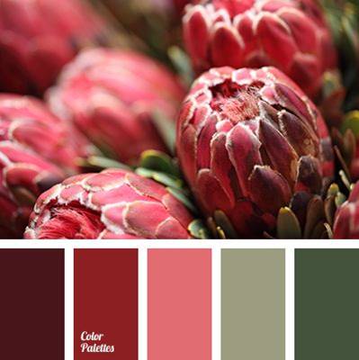
RED.
Warm shades of red:
tomato, brick, coral, poppy red, copper red, fiery red, red fish color, chili pepper color, pomegranate, crimson, mahogany.
Cool shades of red: cherry, raspberry, cranberry, wine, burgundy, ruby, purple, burgundy, beet, cherry.
There is also neutral shades red: scarlet, bloody red, watermelon, cardinal.
There are others, but let's focus on these and try to learn how to see color temperature.
Remember - warm shades gradually turn into orange (red + yellow = orange), cool shades gradually turn into purple (red + blue = purple).
Warm shades of red


Cool shades of red


YELLOW.
Pure yellow is a warm color. It “increases” its temperature even more when red color is added to it. You can “cool” the yellow color by adding blue and blue colors to it.
Remember the differences by association: the peel of a ripe banana has a warm tint, the skin of a lemon has a cold tint. But the color of banana pulp is neutral light shade, neither warm nor cold.

Warm
shades of yellow: golden honey, sulfur yellow, dandelion, mustard, chicken, amber, sunflower, mango, sea buckthorn, curry, turmeric, egg yolk, mimosa.
Cool shades of yellow: lemon, lunar, straw, metallic.
And others.
Remember - warm shades gradually turn into orange (yellow + red = orange), cool shades gradually turn into green (yellow + blue = green).

Warm shades of yellow


Cool shades of yellow


GREEN.
Green color is obtained by mixing yellow and blue colors. If these colors are in equal or approximately equal proportions, then such green itself is neutral in temperature. If yellow predominates, then the shade of green is warm. If blue predominates, then the shade of green is cold.
Warm shades of green: May green colors, olive, green peas, swamp green, linden, reed, khaki, apple green, moss green.
Cool shades of green: pine green, mint, emerald, jade, malachite, smoky gray-green.
And others.
Remember - cool green gradually approaches blue-green, or color sea wave. Warm shades approach yellow-green.


Warm shades of green


Cool shades of green


BLUE.
Pure blue itself is a cool color. Bright and especially dark shades of blue have a very pronounced cold temperature. Such cool shades look icy.
The color “warmers” if you add yellow pigment to it. Or add gray pigment and reduce the brightness, make the color soft, muted. Soft Blue colour becomes relatively warm. But don’t think that adding red to blue will make the color warmer, because red is warm. Let me remind you that when you mix blue and red you get purple, and it is even cooler than blue, since the wavelength of violet is shorter. Therefore, blue with a purple tint is also cold.
Warm shades of blue: sky blue, topaz, blue-green, dark blue, turquoise, petrol, moray eel color, celadon color, black sea color, Prussian blue, hyacinth, steel, denim, blue-gray, gray-blue-green, gray
Cool shades of blue: azure, cornflower blue, electric blue, cobalt, sapphire, indigo, icy blue, royal blue, smoky blue, sea blue, night blue, blue-violet, thunderstorm, blueberry, ultramarine, blue-black, bright blue, cyan .
And others.
Remember - cool blue shades fade into blue, deep black or purple, while warm shades gradually tend towards turquoise and have a greenish or grayish undertone.

Warm shades of blue


Cool shades of blue


Our world has never been monochrome; it contains a huge number of tones and color transitions. Experts say that a person can distinguish about two percent of the shades of what is visible to the eyes of birds and some insects. Instead of the outdated and imperfect system of decomposing white light into seven basic color bands, artists, designers and makeup artists have developed their own table of warm and cold colors, because for painting and coloristics the energy of perception, tone and shades have long become more important than the color itself.
Why do you need a color chart?
To be precise, the seven basic, fundamental colors in nature exist only in our perception for our vision. Color science has actually proven that for the human eye there are only three basic color components - yellow, red and blue, plus an additional white. From these three components any color or shade can be obtained, and it can be made warm or cold by adding something more or less hot than the background color.
As a colorist, there is a clear division of colors into three groups:
- Warm tones include yellow, red and orange;
- The cold group includes blue, cyan, violet;
- Green can be equally classified as both warm and cold, but, according to experts, the green color is a relative of white, that is, completely balanced.
For your information! This division into warm and cold is quite arbitrary; it would be easier to use the concept of free energy. But the problem is that the shades of warm and cold content need to be systematized and, most importantly, selected for compatibility, based on human perception, and not on the basis of these devices.
A person does not have additional sensory organs with which one could try a shade “to the teeth”; all that remains is the receptor sensation of heat and cold, which we are trying to use when classifying into cold and hot bases.
Using a table of cool and warm colors
The practical application of gradation into cold and warm colors is based partly on human psychology on the basis of several rules of mutual influence:
- The definition of “cold” or “warm” occurs only on the basis of a person’s own psychological experience and stereotype. For example, white and blue are associated with ice and snow, so their combination can be considered cold;
- Contacting on one color field two zones of pronounced warm and cold color mutual equilibrium influence. For example, when blue and red colors come into contact, the first becomes softer, warmer, the second becomes emotionally piercing and harsher;
- Mixing color bases with each other with the addition of white allows you to control the visual color temperature.
For your information! Using the last two points, the table tries to describe the mechanism of how you can make the perception of a shade warmer or colder, since the associative method does not give a 100% result.
The same combination of white and blue different people can cause completely different associations. For some it is cold blue ice and snow, for others it is a hot blue sky around a white sun. Therefore, we moved from psychology to the temperature of the color matrix.
How to change color temperature
The easiest way to illustrate the effect of changing color temperature is with the three most important colors to us, yellow, green and red.
For a warm yellow color, you can increase the temperature only by adding shades with lower energy, for example, red, as in the table.

Warmer than basic yellows include, for example, honey yellow, dandelion or sunflower.


To transition to cooler tones, add green or blue.

Red is warmer energetically than yellow, so its temperature is more difficult to control. The gradation of energy in different shades of red is the most difficult to perceive.

To make a red color cooler, you have to shift its background towards violet using the addition of blue and gray.

Insulating red is much easier with the addition of yellow.
Green color changes according to temperature saturation much more easily, since it can be obtained by mixing two components with different temperatures - yellow and blue. The procedure for imparting the necessary energy actually comes down to enhancing one of the color components.
Warm and cool purple colors differ in their blue undertone content. Although it is the spectral color that has the shortest wavelength, its cousin purple is the result of both the longest wavelength (violet) and the shortest wavelength (red) hitting the retina.
True purple is a dark, deep, cold tone, however, such a pure color in nature is a rare occurrence; most often we are dealing with complex colors. The main admixtures of this tone are: red, which inclines the shade to the warm side, and blue, which leads to a cold range. In addition to this there is also gray, black and white tone, significantly affecting the sensation of color. And since they are cold, it would be logical to suggest that the cold range should prevail over the warm ones, but this is not so. Derivatives of purple and red-violet are much more widely represented, and even if they contain black, white or gray, they still do not cross the threshold of winter tones.


As the brightness of the colors decreases, cold violet do not lose their properties, but warm ones become cooler, but it is not equal to the first ones.

Darker ones are colder than light ones. This applies to both cool and warm tones.
From violet to purple, there is a whole gradient of bright shades built on the change in the pure spectrum from 100% violet to 100% +100% (violet + red) = purple. Essentially it's two different colors, but their line has become so blurred in our minds that they began to represent one color class for us.
Cold purple and its shades
Cold purple is not only a deep cosmic tone, but also light, medium shades, formed both from the main one and with an admixture of blue, gray, black and white. This range contains the most dark colors, lilac and the lion's share of gray-violet tones.
Cool purple color photo

Deep violet (1), blue violet (2), dark violet (3), black violet (4), bright lilac (5), blue lilac (6), light lilac (7), pale -lilac (8), blue-violet (9), light gray-violet (10), charoite color (11), dark gray-violet (12).
Warm purple and its shades
Warm purple shades originate from lilac derivatives, which look pink next to rich violet-purple tones, but, in fact, are already leaving this range.
They are followed by the amethyst range: light, bright and muted shades - close relatives of purple.
Purple is rich and rich. In terms of its temperament, it can be ranked with red, raspberry, and burgundy. And therefore it dark shades, such as plum and eggplant will take a “warm position”.
The red-violet range occupies an almost intermediate value between warm and cold, but loses to dark violet and blue-violet.
Warm purple color photo

Glycine (1), lilac lilac (2), thistle (3), amethyst (4), orchid (5), blackberry (6), purple (7), red violet (8), brown violet (9) , grape (10), plum (11), eggplant (12).
Cool purple goes well
Cool medium violet tends to enter into temperature contrast, although it is better to maintain average values. Pairs with light green, herbal, shades of peach, brown, sunset pink, dark red, etc. will be so pleasant. Cold combinations with turquoise, gray-green are also possible, but they leave a feeling of incompleteness. Dark purple tones are combined according to the principle of black: high light contrast or according to the principle of a color spot.


Warm purple blends
To create a warm-cold contrast, such shades of purple will need warmer colors: orange, yellow, gold, but we still won’t see a sharp resonance: a rich, cheerful color will open before us.


Cool purple and warm go together
Yet more often than not, warm and cool purple tones end up together, creating a deep palette that takes center stage. In this case, the warm-cold contrast fades into the background, allowing the viewer to be completely immersed in the mysterious, bewitching world of violet-purple.